Turning PPE Complexity Into Straightforward Experiences
A safety-first redesign for Mallcom India, driven by yellow, bold brand colors, and geometric elements lifted from the logo to create a seamless, energetic user experience.
Challenge
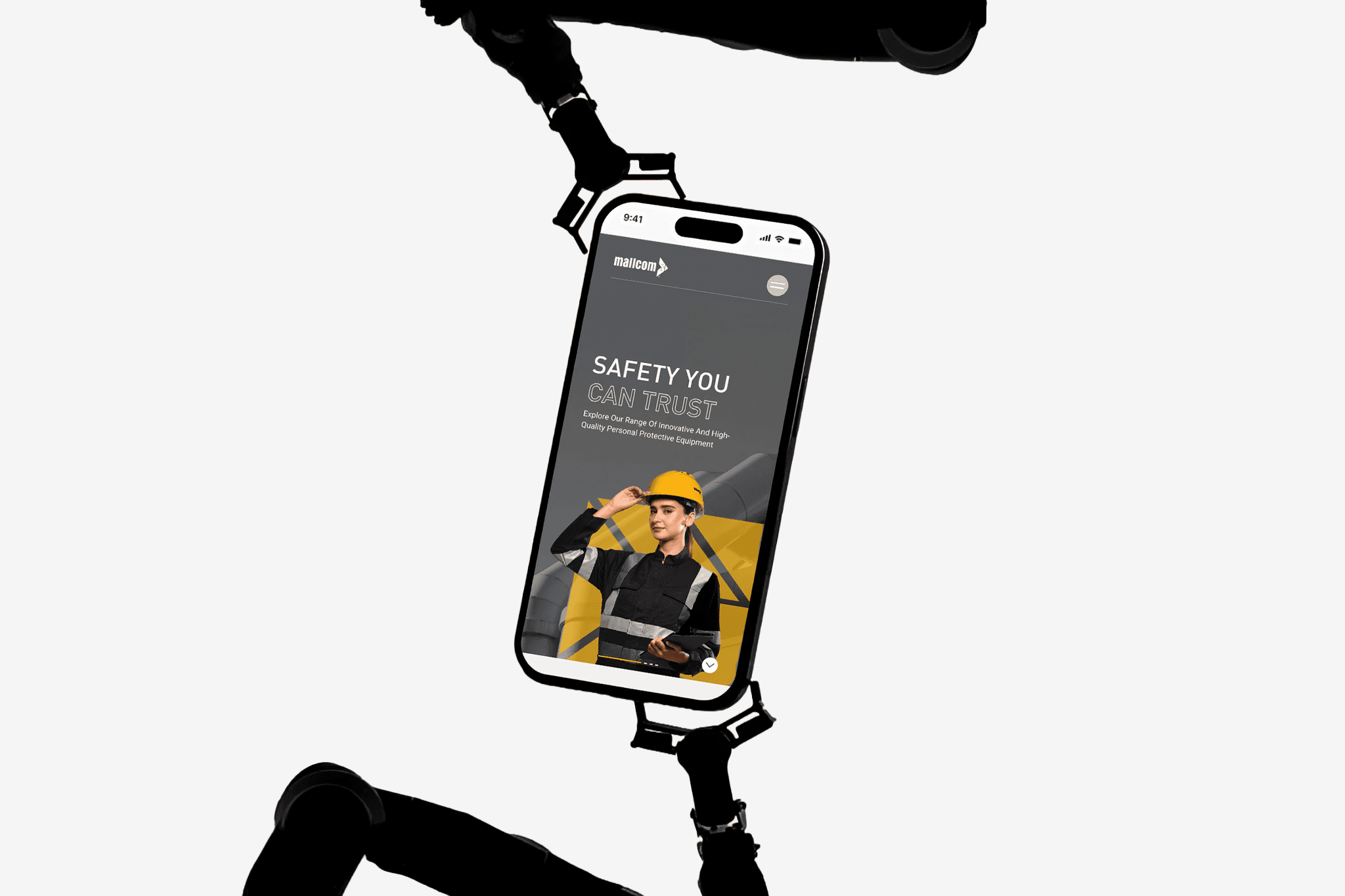
Mallcom India, a pioneer in PPE solutions, had a digital presence that no longer matched its global vision. The old website lacked the modern design language and contemporary aesthetics needed to communicate innovation and leadership on an international stage. A vast product portfolio spanning multiple industries only added to the challenge, with overlapping categories creating a fragmented and confusing browsing experience. Users struggled to navigate, explore, and connect with the right solutions. This called for a complete redesign, one that could elevate Mallcom’s digital identity, simplify product discovery, and bring the brand experience in line with global standards.
Category
Communication Design / UIUX & Web Design
My Role
Design Lead

Solution
The redesign of Mallcom India’s website was more than a visual upgrade, it was a reimagining of how the brand presents itself to the world. By embracing the vitality of yellow and the strength of geometric elements inspired by the logo, the new design radiates both safety and energy. A carefully structured navigation untangles overlapping product categories, making discovery effortless across industries. Through interactive storytelling and evocative language, the platform celebrates Mallcom’s legacy while illuminating its future ambitions, creating not just a website but a dynamic brand experience that resonates with global audiences.


