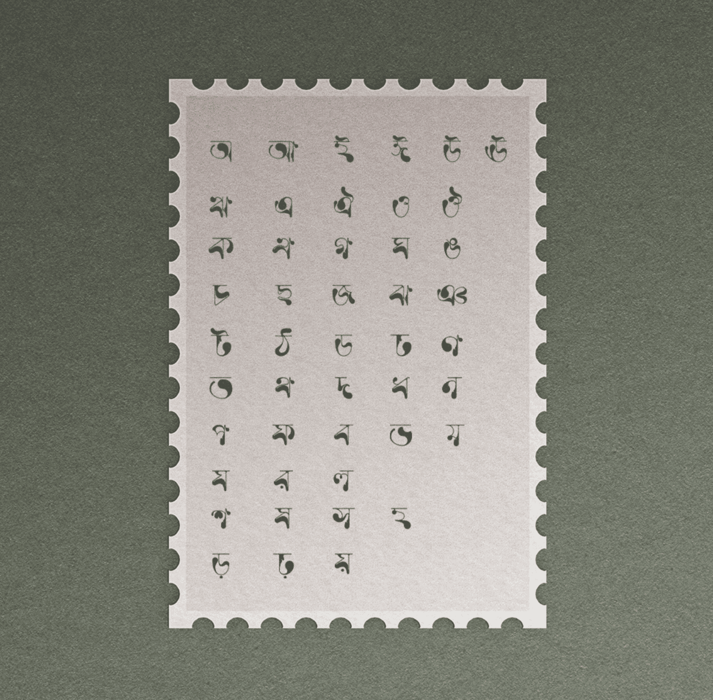
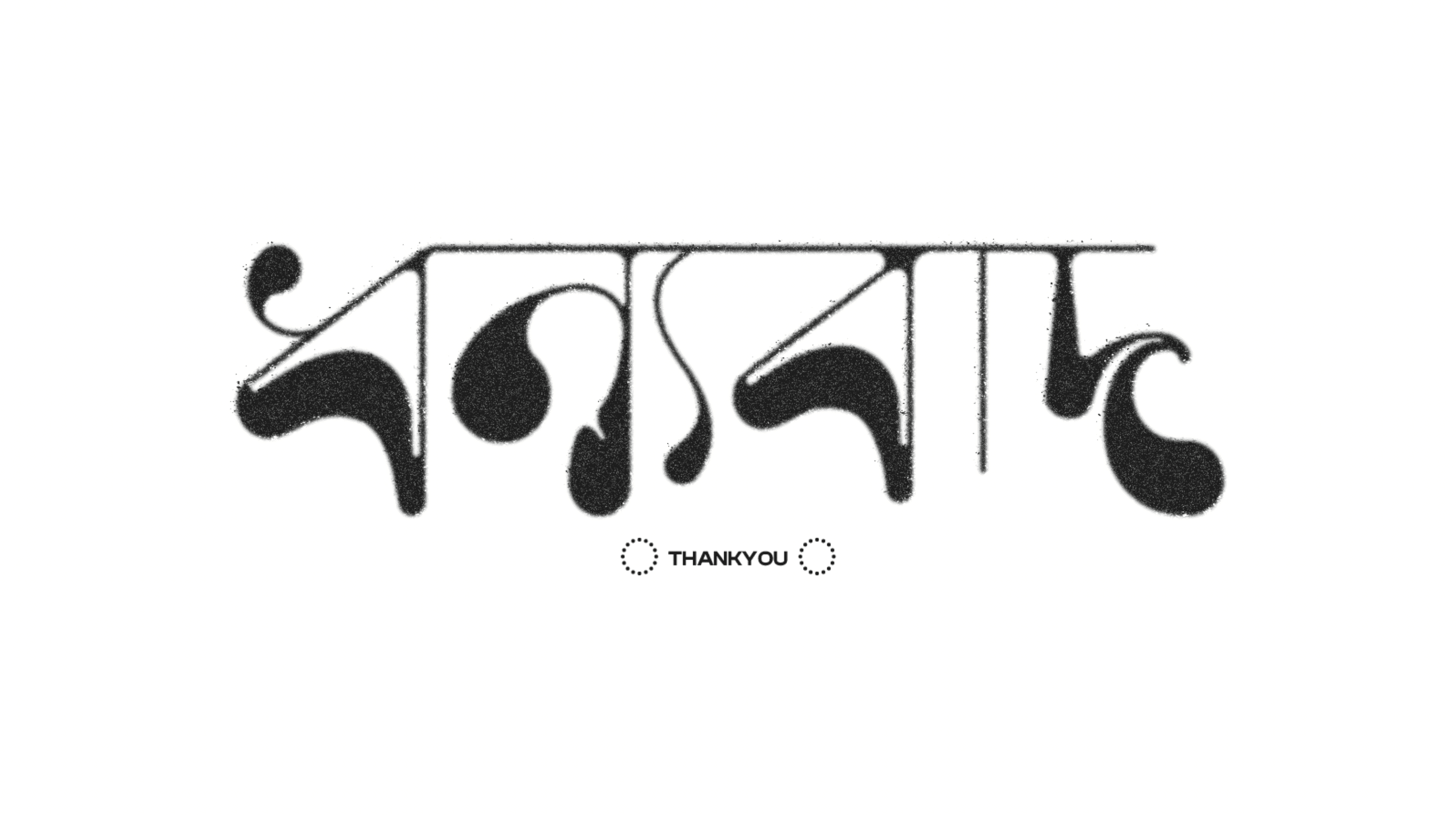
Experimental Bengali Display Typeface
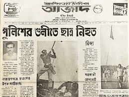
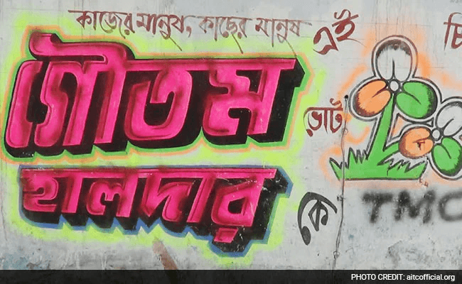
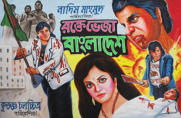
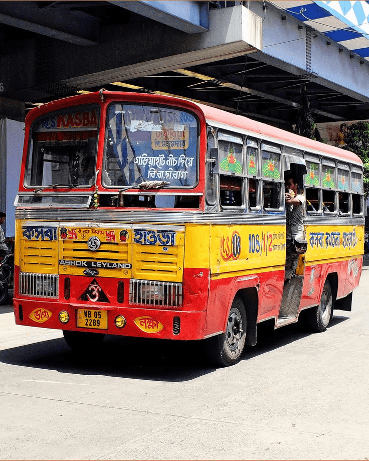
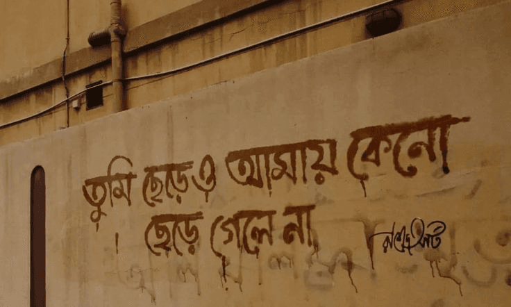
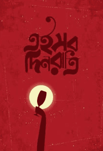
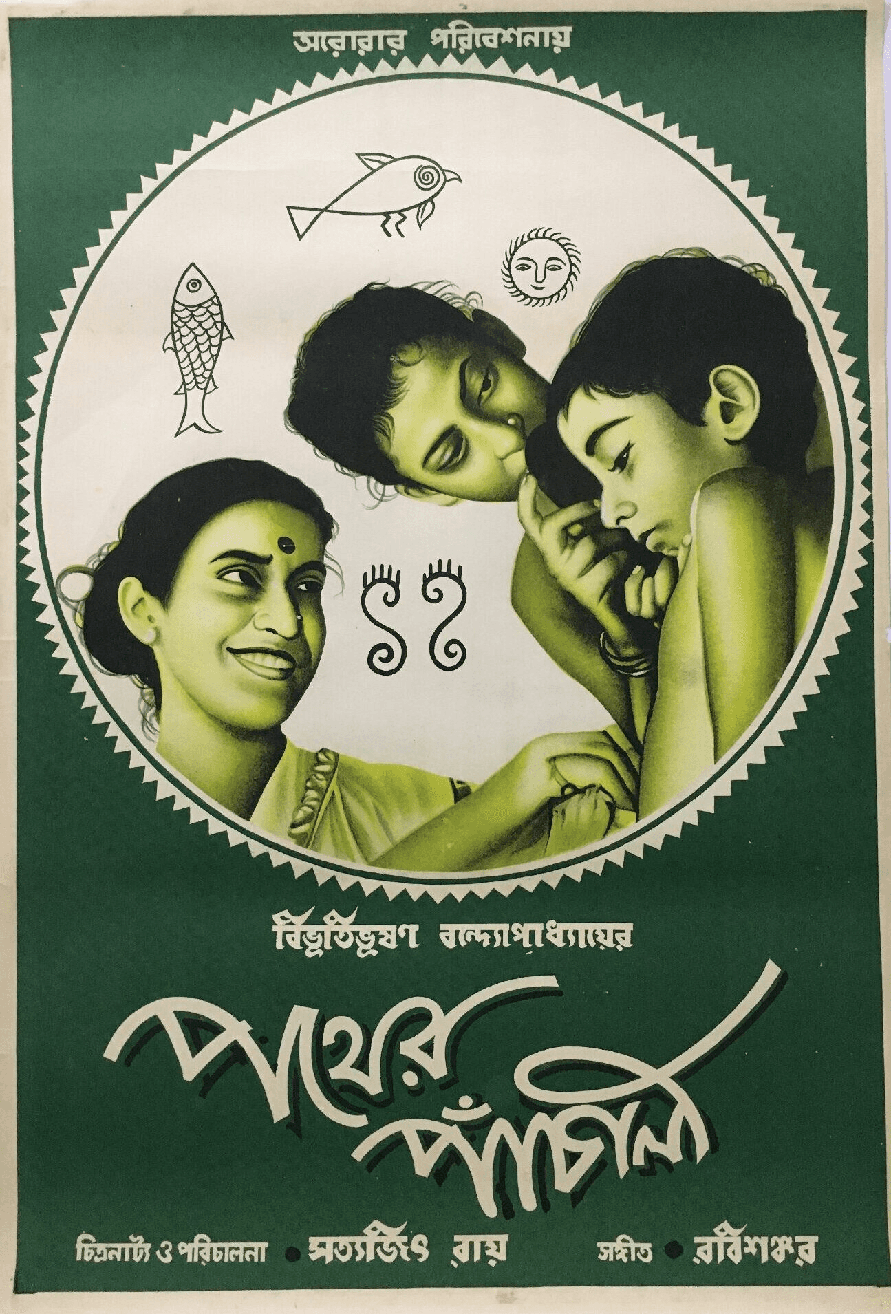
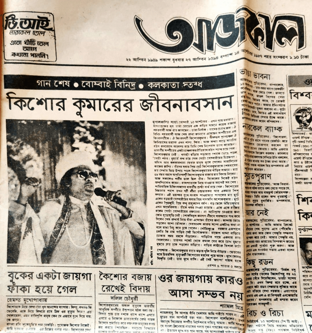
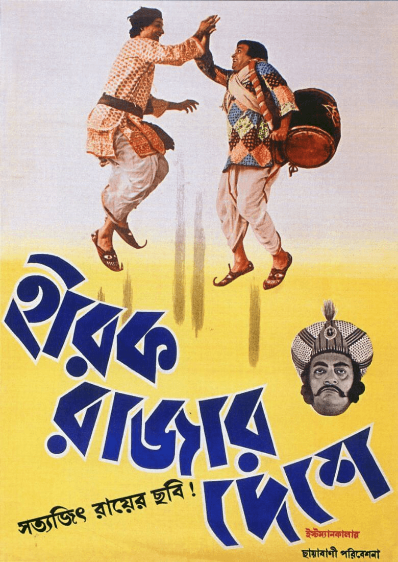
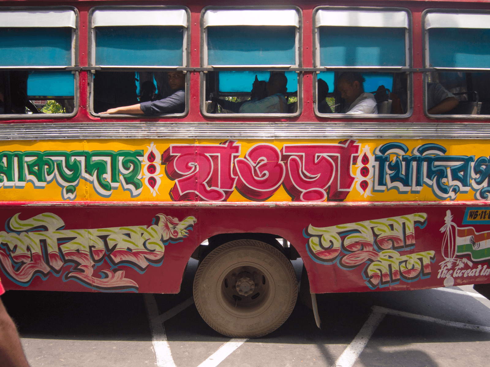
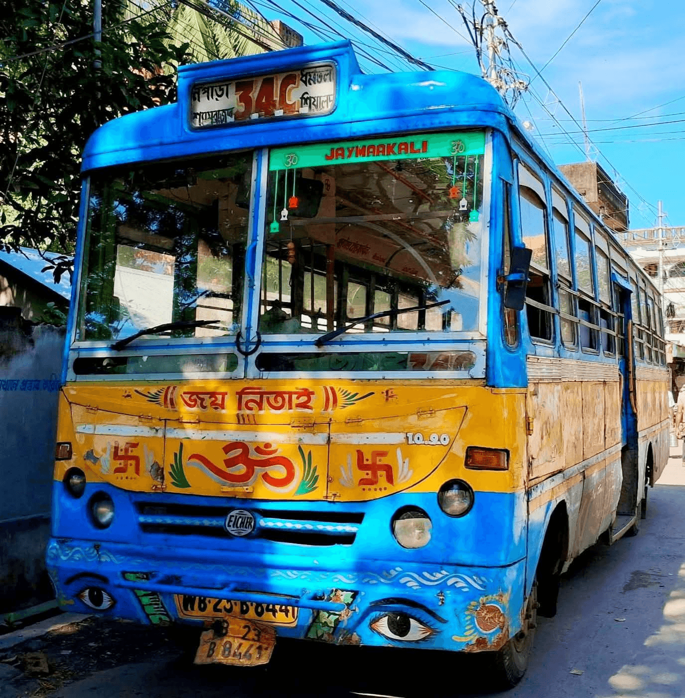
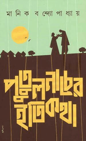



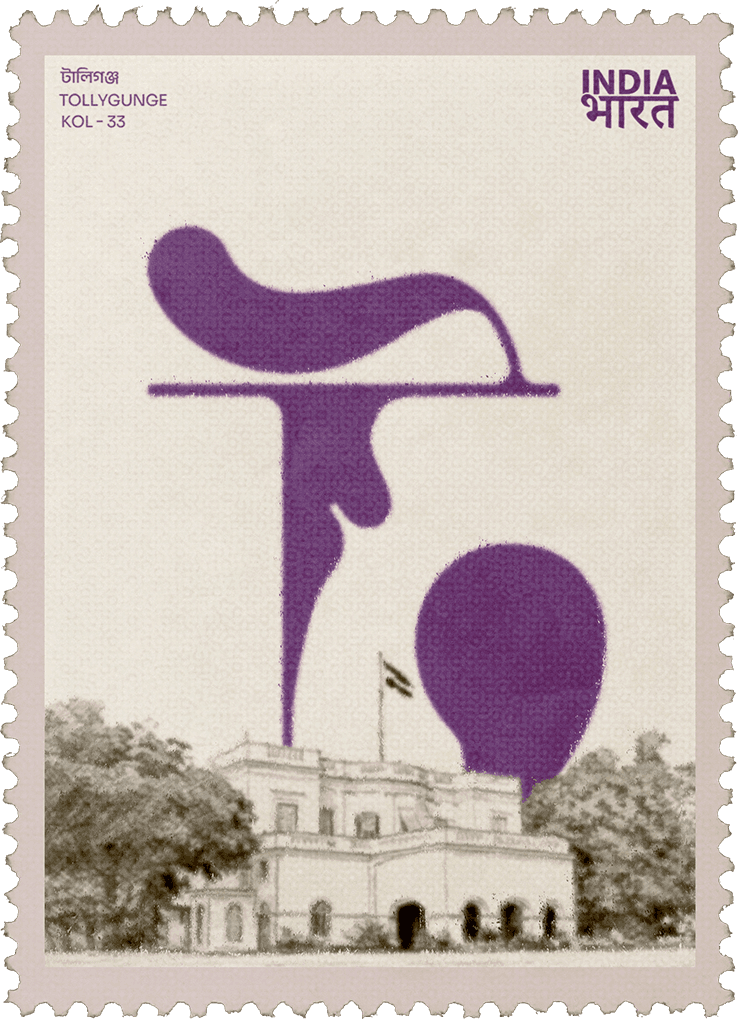
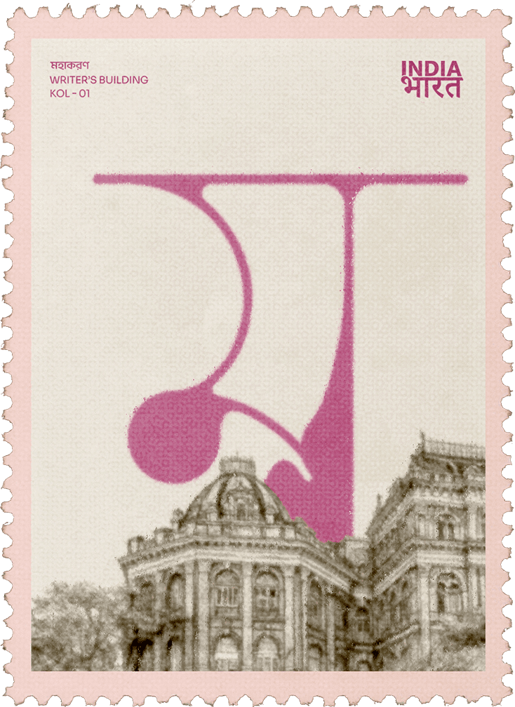
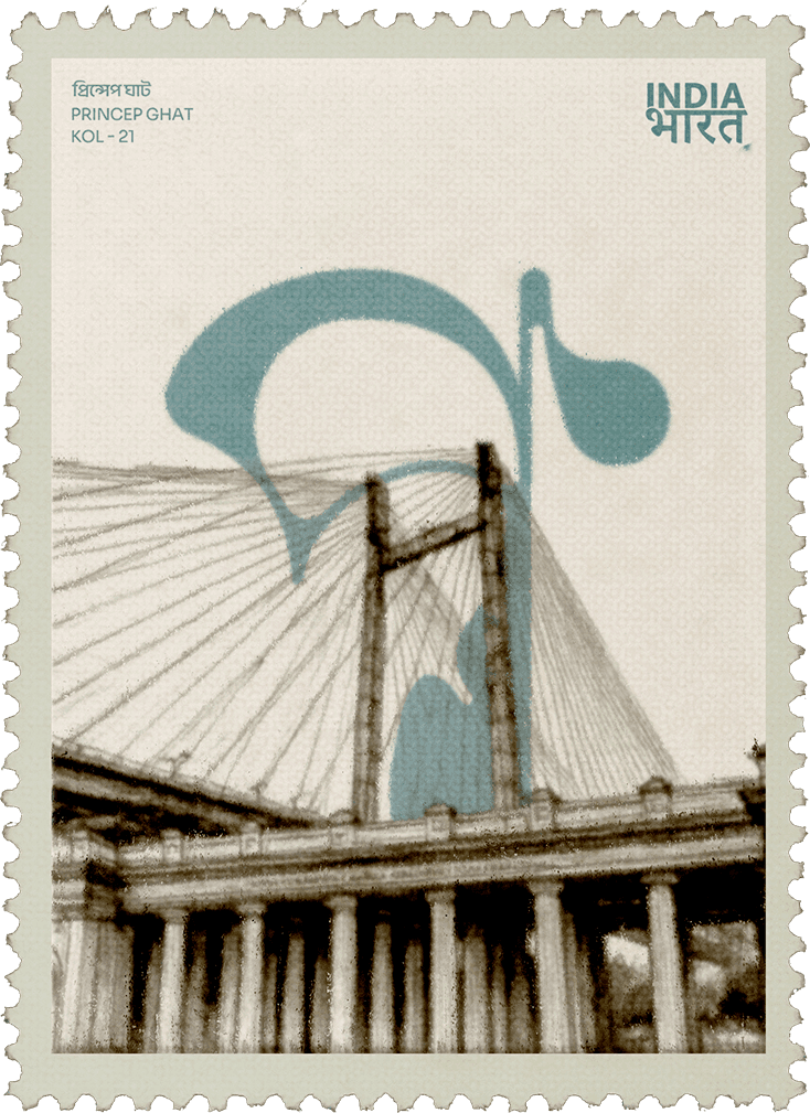
A display typeface inspired by the emotional, organic quality of ink on paper. Bangla Blot pays homage to Bengali literature, handwriting, and the evolution of Bengali visual culture. The typeface explores softness, irregularity, and human touch while preserving recognisable Bangla forms.
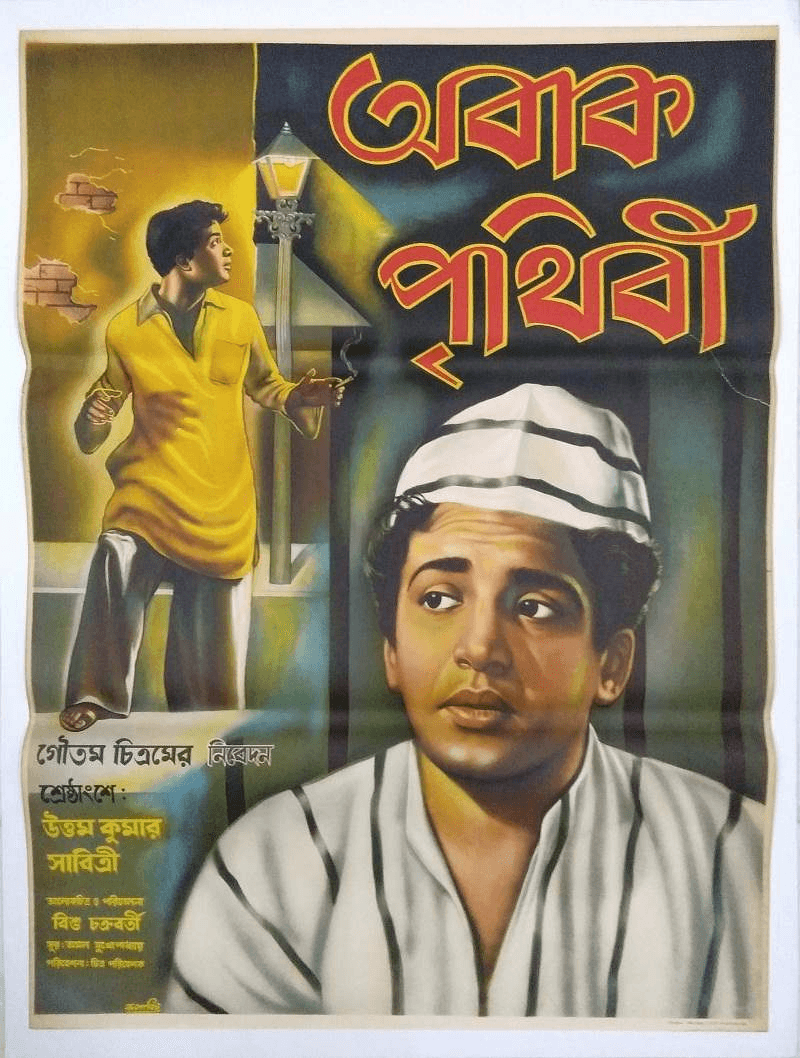
Drawn from ink blots, manuscript textures, old book covers, and the expressive marks found in traditional Bengali writing. The idea was to capture literary warmth and the imperfections that make physical ink feel alive.

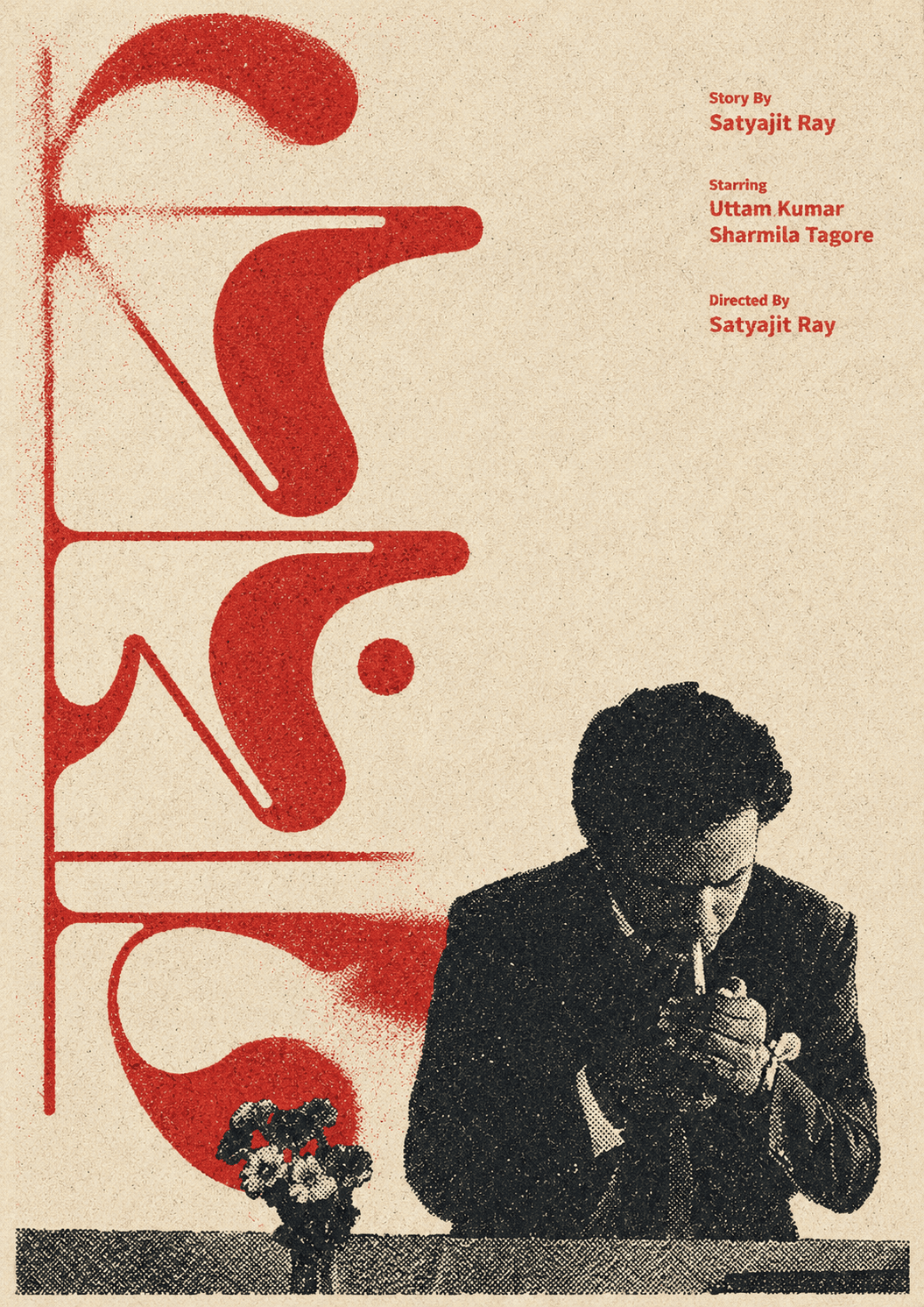
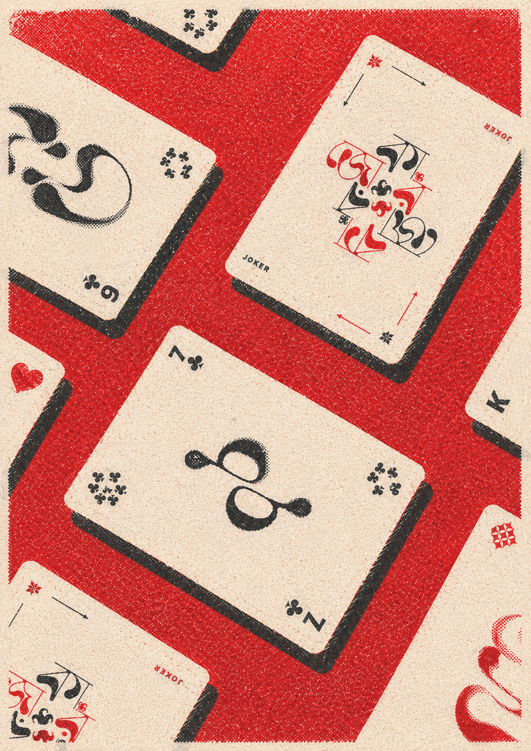


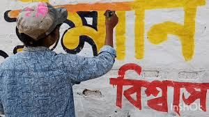
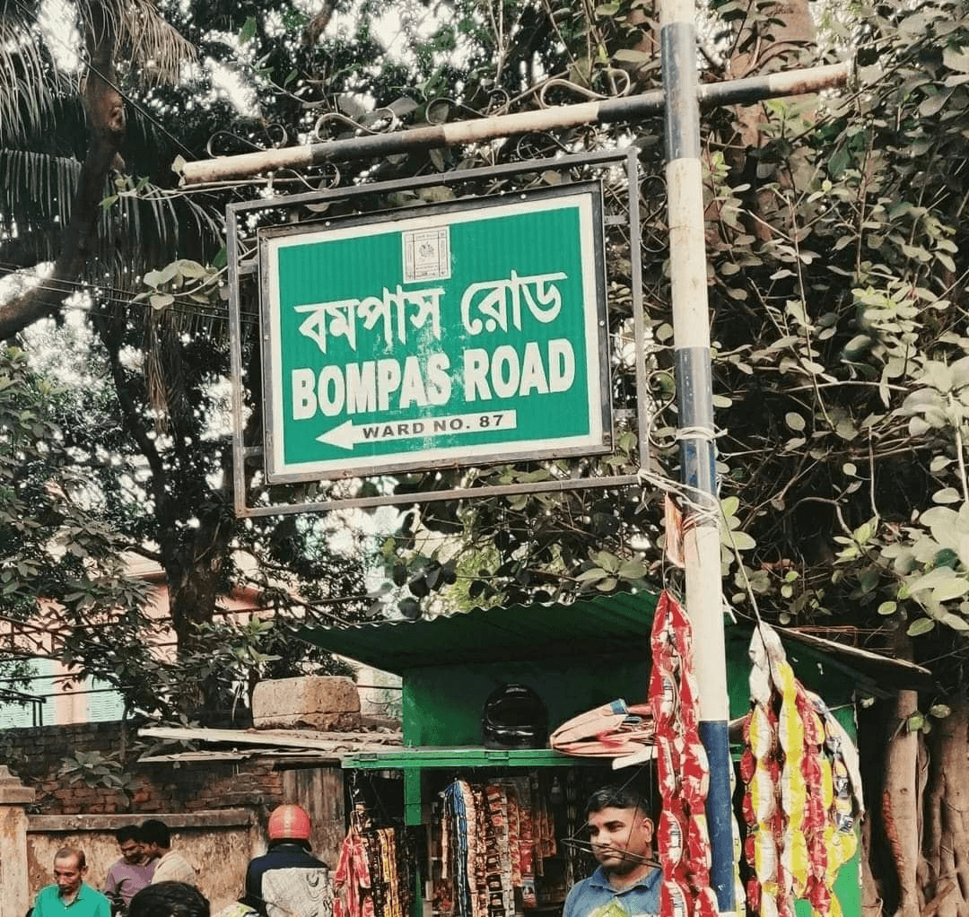
While studying old Bengali print ephemera, fading cinema posters, and rain-soaked street signage in Kolkata, I became interested in the moment where typography stops being perfectly readable and starts becoming emotional.
The idea grew from observing how Bangla script behaves under motion, ink bleed, low resolution, and imperfect reproduction. Bangla Blot is an attempt to preserve that fleeting softness without losing the cultural rhythm of the script itself.

Once the core anatomy of the script was resolved, I shifted focus towards introducing personality into individual glyphs. Certain counters were exaggerated, terminals softened, and intersections intentionally overloaded to create the sensation of spreading ink.
Despite maintaining consistent formal rules underneath, Bangla’s layered conjuncts and complex curves naturally generated darker textures across words. Much of the process became an exercise in managing controlled visual chaos.
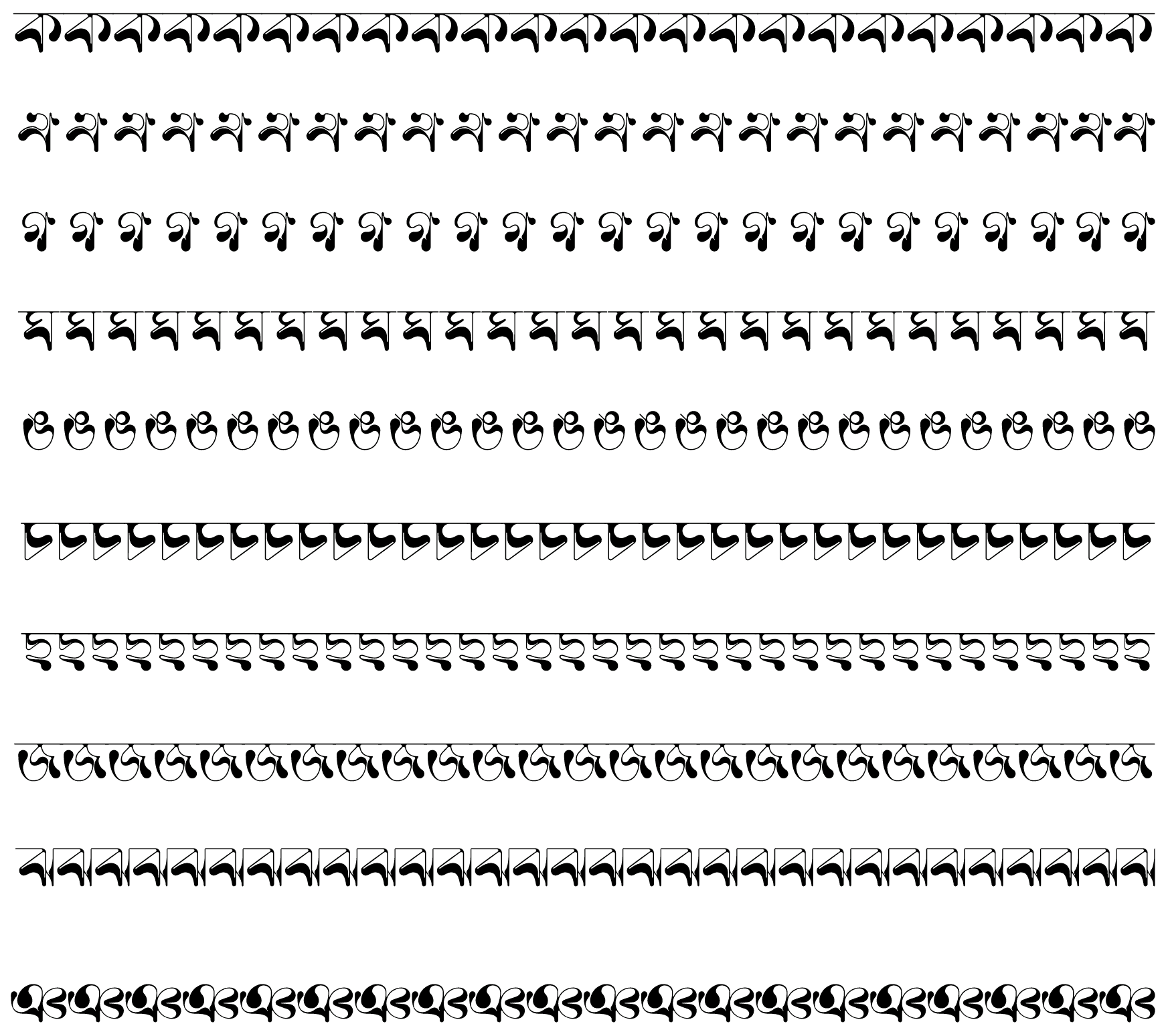
Bangla Blot emerged from the idea that Bangla script already contains movement within its curves and joins. Instead of freezing that movement into rigid geometry, the typeface exaggerates its fluidity until the letters begin to vibrate visually.