Picklebay: An Identity Built on Movement and Community
Picklebay defines how pickleball shows up as a brand, not just a product. It is built as a visual and behavioural identity system that reflects the sport’s dual nature, social yet competitive, structured yet informal.

Where Identity Evolves Through Participation
The identity is designed to adapt across different player journeys, from beginners to advanced competitors, without losing coherence. Rather than staying static, it evolves through participation, embedding itself into interactions, progression, and community engagement. The result is a brand that does more than enable play. It shapes perception, builds belonging, and creates a consistent language for how pickleball is experienced, shared, and recognised as it continues to grow.
Category
Logo Design / Identity Design / Branding
My Role
Design Lead

Design Directions
1. Visual Language
Clean base with moments of energy
Gamified cues without over-saturation
Motion and nudges to drive engagement
2. Communication
Action-oriented microcopy
Community-driven tone
Encouraging, not instructional
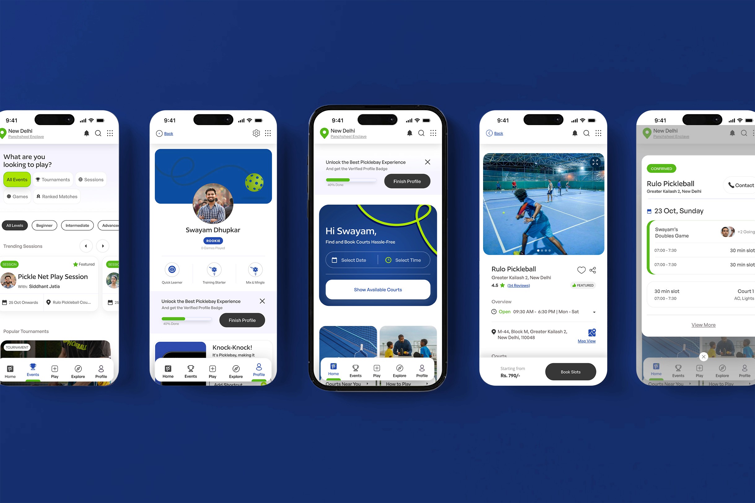
Experience Branding
Streaks and badges
Leaderboards
Smart nudges
Social feed interactions

Visual identity System
Flow & Motion
Built around movement, arcs, and directional flow.
Inspired by the rhythm of rallies and player interaction.
Subtle gamification cues embedded into UI elements.
Colour & Contrast
A high-energy palette grounded with neutral structure.
Designed to shift between playful and competitive contexts.
Typography
Streaks and badges
Leaderboards
Smart nudges
Social feed interactions
Iconography & Elements
Functional at the core but designed to feel alive.
Used as carriers of interaction, not just symbols.


Where Players Find Their Place
Picklebay started as a way to organise how people play, but it quickly became about something deeper. It’s about giving the sport a sense of identity that people can recognise and feel part of. Instead of treating every action as a transaction, the system connects moments, showing up, playing, improving, coming back, into something continuous.
The identity doesn’t sit on top as decoration. It lives inside the experience, shaping how players interact, progress, and see themselves within the community. . In the end, Picklebay isn’t just helping people play more. It’s helping the sport feel like something people belong to.
Picklebay — An Identity Built on Movement and Community
Picklebay — An Identity Built on Movement and Community
Picklebay defines how pickleball shows up as a brand, not just a product. It is built as a visual and behavioural identity system that reflects the sport’s dual nature, social yet competitive, structured yet informal.
Where Identity Evolves Through Participation
The identity is designed to adapt across different player journeys, from beginners to advanced competitors, without losing coherence. Rather than staying static, it evolves through participation, embedding itself into interactions, progression, and community engagement. The result is a brand that does more than enable play. It shapes perception, builds belonging, and creates a consistent language for how pickleball is experienced, shared, and recognised as it continues to grow.
Category
Logo Design / Identity Design / Branding
My Role
Design Lead
Design Directions
1. Visual Language
Clean base with moments of energy
Gamified cues without over-saturation
Motion and nudges to drive engagement
2. Communication
2. Communication
Action-oriented microcopy
Community-driven tone
Encouraging, not instructional
Action-oriented microcopy
Community-driven tone
Encouraging, not instructional
Experience Branding
Streaks and badges
Leaderboards
Smart nudges
Social feed interactions
Visual identity System
Flow & Motion
Built around movement, arcs, and directional flow.
Inspired by the rhythm of rallies and player interaction.
Subtle gamification cues embedded into UI elements.
Colour & Contrast
Colour & Contrast
A high-energy palette grounded with neutral structure.
Designed to shift between playful and competitive contexts.
A high-energy palette grounded with neutral structure.
Designed to shift between playful and competitive contexts.
Typography
Streaks and badges
Leaderboards
Smart nudges
Social feed interactions
Streaks and badges
Leaderboards
Smart nudges
Social feed interactions
Iconography & Elements
Iconography & Elements
Functional at the core but designed to feel alive.
Used as carriers of interaction, not just symbols.
Functional at the core but designed to feel alive.
Used as carriers of interaction, not just symbols.


Where Players Find Their Place
Picklebay started as a way to organise how people play, but it quickly became about something deeper. It’s about giving the sport a sense of identity that people can recognise and feel part of. Instead of treating every action as a transaction, the system connects moments, showing up, playing, improving, coming back, into something continuous.
The identity doesn’t sit on top as decoration. It lives inside the experience, shaping how players interact, progress, and see themselves within the community. . In the end, Picklebay isn’t just helping people play more. It’s helping the sport feel like something people belong to.