A brand built around the aspirations, struggles, and daily hustle of gig workers
Overview
India's gig economy runs on movement.
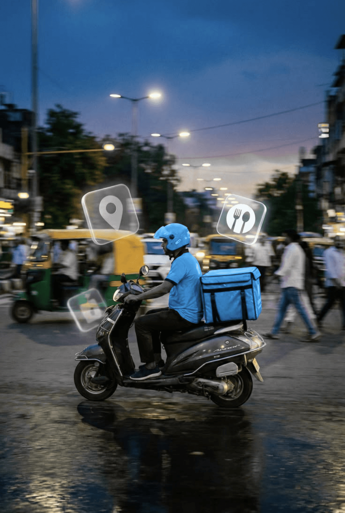
Every day, thousands of delivery riders navigate crowded streets, unpredictable weather, traffic congestion, and demanding delivery schedules. Their vehicle isn't simply transportation. It is their livelihood.
Raft Cosmic building a new EV leasing platform focused entirely on gig workers and fleet operators. While the business model and technology ecosystem were taking shape, the brand lacked a clear identity capable of connecting with the people it was built for.
Category
Logo Design / Identity Design / Branding
My Role
Design Lead
© Raft Cosmic
NOTE: This work has been produced by Kwazi Design LLP, who are the owners of this Intellectual Property alongwith the respective client.
My role in the project is specified.


The Challenge
The EV mobility space is crowded with brands that primarily communicate technology, sustainability, or performance.
Skoot.ev operated in a different space.
Its primary audience consisted of delivery riders working for platforms such as Swiggy, Zomato, Blinkit, Zepto and various logistics providers. These users often spend 10 to 14 hours on the road and depend entirely on their vehicle to earn an income.
The challenge was to create an identity that felt:
Trustworthy
Empowering
Highly visible
Easy to understand
Practical rather than aspirational
Distinct from existing EV mobility brands
Most importantly, the brand needed to speak the language of its users.
Literally and emotionally.

Understanding The Audience
Before exploring visual directions, understanding the realities of gig workers was paramount.
Research revealed recurring themes:
Income Uncertainty
Workers dealt with fluctuating earnings, maintenance costs and changing incentive structures.
Physical Demands
Long working hours, traffic, weather exposure and delivery pressure were everyday realities.
Digital Friction
Most users were comfortable using apps but often struggled with overly complicated interfaces and unnecessary interactions.
Need For Respect
Many workers felt invisible despite being essential to urban life. They wanted brands that acknowledged their contribution and treated them with dignity.


Defining The Brand
Through workshops and discovery sessions, a clear emotional territory emerged.
The brand owns empowerment
Through stakeholder workshops and discovery sessions, a clear idea emerged: Skoot.ev is not just a vehicle rental service, but an enabler of opportunity. By providing reliable EVs without the burden of ownership, the brand helps gig workers earn with greater freedom, confidence, and stability. This sense of empowerment became the foundation of the brand.


Identity Direction
The strategic positioning occupied a unique space between mass-market accessibility and contemporary design.
Rather than feeling corporate or technology-heavy, the identity was designed to make riders feel proud.
The brand needed to celebrate the hustle rather than simply facilitate it.
Logo Design
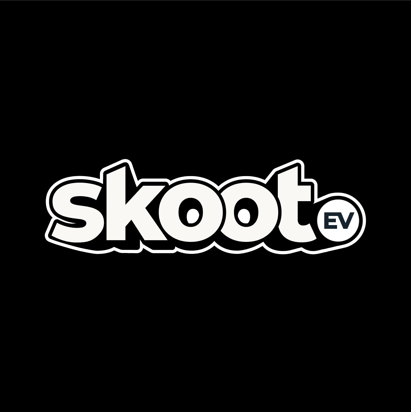
The chosen identity direction was built around three core principles: minimal, bold, and mobility-inspired. Designed to maximise visibility and recognition across scooters, rider gear, helmets, and digital platforms, the logo uses forward-leaning letterforms and dynamic curves to convey movement and momentum. Subtle details within the wordmark reinforce the category, with the double "OO" referencing the two wheels of a scooter and the circular EV lockup acting as a visual symbol of electric power. The result is a confident, energetic, and highly legible identity that feels rooted in mobility while remaining simple and memorable.


Colour Strategy
The final colour system was designed to balance:
Visibility
The brand needed to stand out in crowded urban environments.
Trust
Colours needed to communicate reliability rather than novelty.
Energy
The palette needed to reflect movement, ambition and optimism.
The result was a bold, highly recognisable visual system capable of performing equally well on vehicles, rider gear and digital platforms.


Typography
The audience engages with content in regional languages, typography became a critical component of accessibility.
The system prioritised:
High-readability
Mobile-first experience
Multilingual flexibility
Strong visual presence
Display typography was evaluated across both Latin and regional scripts to ensure consistency and impact across Hindi, Bengali, Marathi and other markets.

Designing Beyond The Logo
The identity was developed to work across a diverse ecosystem of touchpoints:
Mobile app
Website
Scooter wraps
Helmets
Rider apparel
Social media
Hoardings
Marketing collaterals
Every application was designed around visibility, clarity and consistency.
The Outcome
The final identity transformed Skoot.ev from a leasing service into a rider-first mobility brand.
The system combines:
High-visibility
Strong recall
Multilingual accessibility
Scalable application
Emotional Relevance
Most importantly, it gives the people behind the deliveries something often missing in the category:
A brand that recognises their ambition and reflects their pride.