A brand built around authentic flavours, regional stories, and making Indian cooking easier for everyone.
Overview
CURRYiT began with a simple belief: great Indian food should be easy to make, without compromising on the flavours and traditions that make it special. What started as a shared love for India’s diverse cuisine between two co-founders soon grew into a mission to bring authentic regional cooking into everyday kitchens.
The journey began with the OG Curry Paste, created to capture the richness of regional Indian recipes while making them simpler to prepare. Made with carefully selected, clean and quality ingredients, it helped home cooks recreate the familiar flavours of India with less effort and more confidence.
Today, CURRYiT has grown beyond curry pastes to include cooking pastes, soups, chutneys, and more. Yet the idea remains unchanged: making authentic Indian cooking accessible, effortless, and enjoyable, while inspiring everyone to cook, share, experiment, and take pride in their food.
Category
Logo Design / Identity Design / Branding
My Role
Creative Direction / Design Lead
© CurryiT
NOTE: This work has been produced by Kwazi Design LLP, who are the owners of this Intellectual Property alongwith the respective client.
My role in the project is specified.

Logomark & Visual Refinements
The logo underwent a considered evolution rather than a complete redesign. We refined its form to improve legibility while preserving the familiarity and recognition that customers already associated with the brand. Ensuring the logo remained instantly recognisable was central to the process.
Working within the equity of an established mark, we refined its structure to make it more adaptable and effective across consumer-facing applications. The resulting visual system retains a distinctive character, supported by both inline and stacked configurations, allowing the logo to work seamlessly across packaging, exhibitions, marketing collateral, and other brand touchpoints.


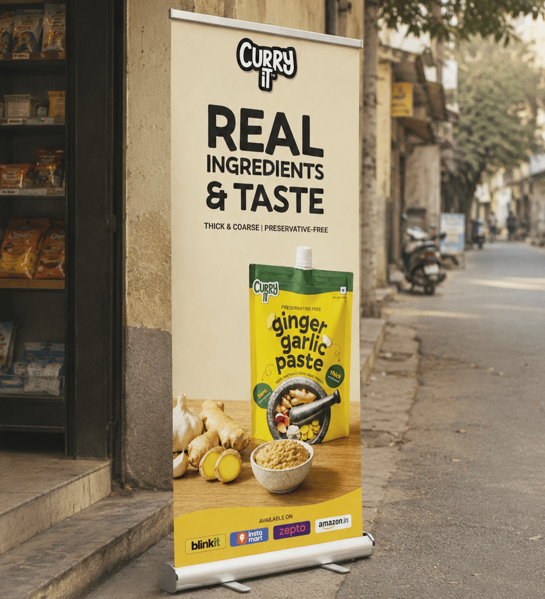
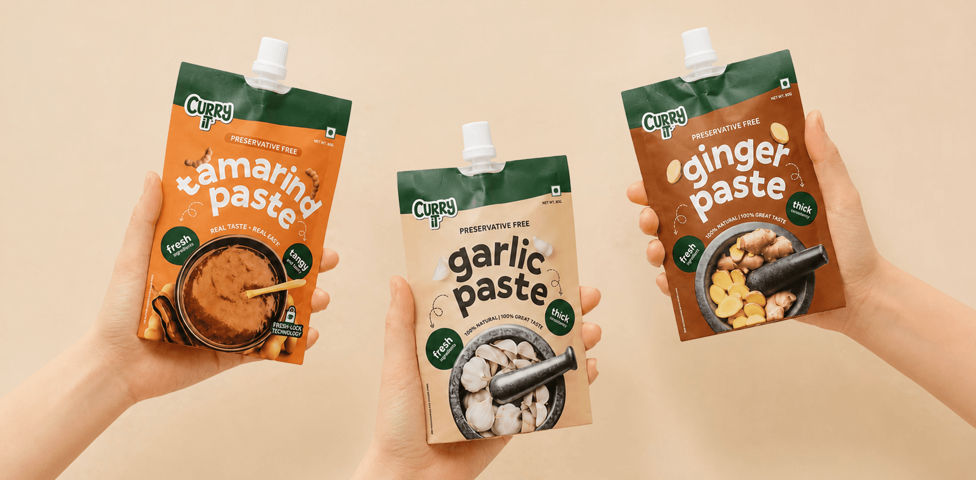
Packaging & Applications
Bringing out the story of a brand through its packaging is imperative to long-term brand building.
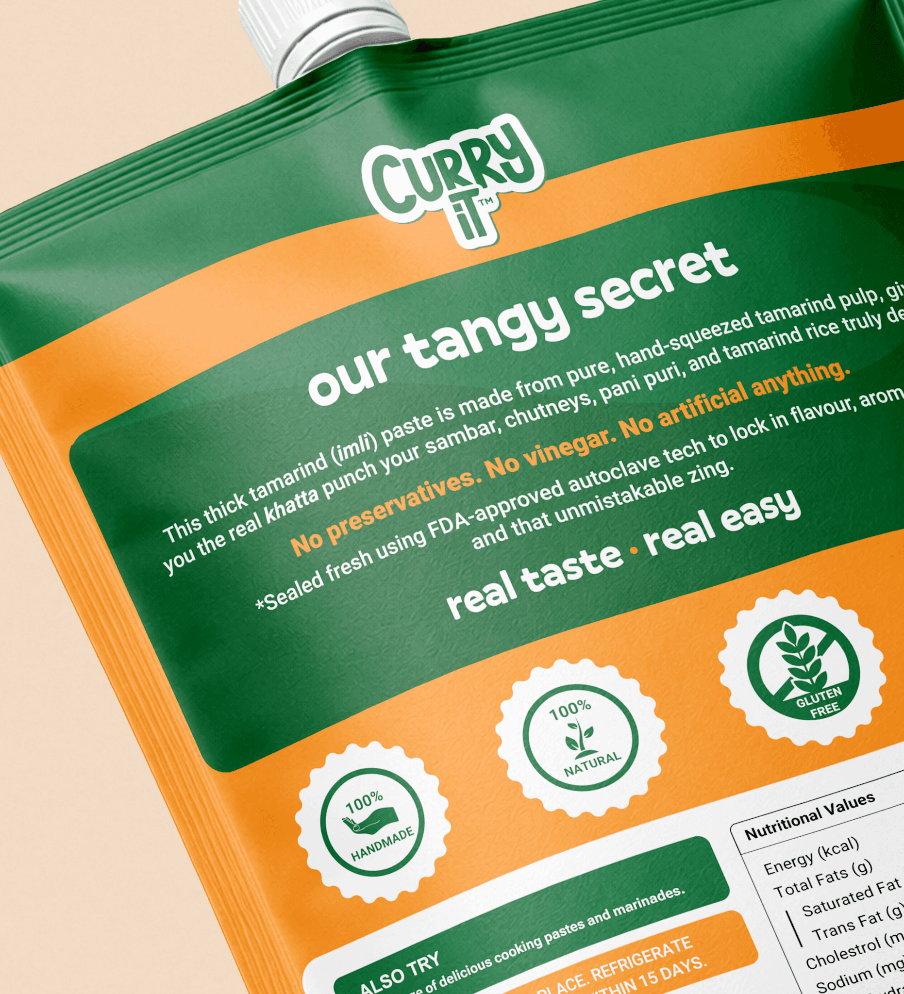
Grounded in consumer psychology and research, we developed a brand architecture designed around how people perceive, process, and connect with visual information. Colour, typography, hierarchy, and visual cues were carefully considered to create a distinctive and intuitive identity, helping CURRYiT communicate clearly and build recognition with Indian consumers and audiences around the world.

Brand Architecture
CURRYiT’s original identity was developed as a pilot for its range of curry pastes, initially launched in jars across Delhi NCR. As the business expanded and entered the increasingly competitive FMCG landscape, the brand needed a more robust and scalable identity system.
Recognising the opportunity to build for long-term growth, the Founders identified the need for greater flexibility and upward mobility across the brand, particularly in packaging. A strategic brand architecture was therefore developed to create a strong foundation for evolution, enabling CURRYiT to grow thoughtfully over time while staying aligned with the Founders’ long-term vision.


Website Design
As brand strategy and design partners, we believe every touchpoint should feel like part of the same brand world. Working closely with the CURRYiT marketing team, we created an eCommerce experience that translated the visual language of the physical brand into a digital environment.
From regional influences and the stories behind each recipe to the intrigue of secret ingredients and the authenticity of Indian cooking, every distinctive element of CURRYiT’s identity found a considered place across the website. The experience was designed to create a familiar, engaging connection with customers while making the journey from discovery to purchase intuitive and seamless.